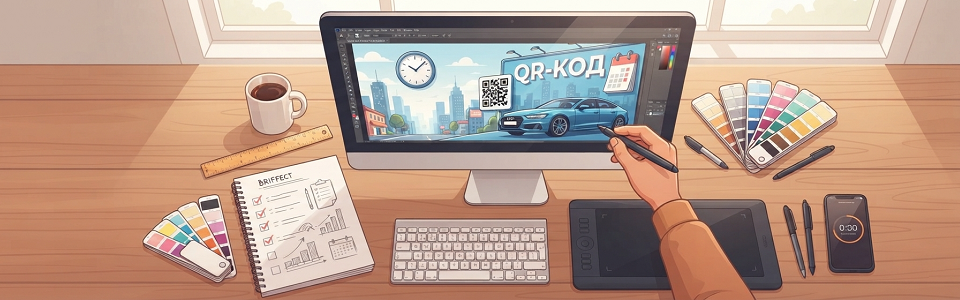

A strong billboard design brief combines the marketing objective, location context, message, technical parameters, and approval schedule. It helps the designer set a clear hierarchy, test visibility at a realistic distance, and prepare production-ready files on time.
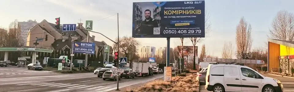
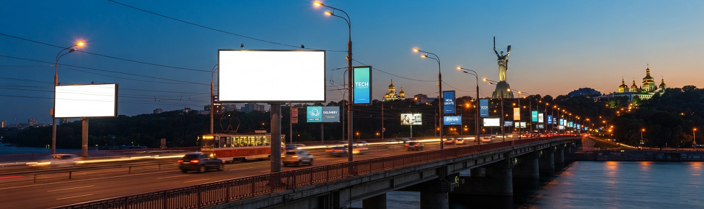
Review the out-of-home advertising on billboards section before concept development: the address, direction of travel, advertising face, surroundings, structure type, and format affect the composition. One universal layout rarely works equally well on a high-speed road, near an intersection, and beside a shopping center entrance.
What should the designer receive before work begins?
The design brief should answer seven groups of questions. If information is missing, mark it for confirmation and assign responsibility. Assumptions about size, trimming, or visible areas can easily lead to expensive revisions.
- Campaign objective. What should happen after the contact: should people remember the brand, turn toward a venue, notice an opening, use an offer, or visit a landing page?
- Audience and route. Who sees the advertising structure, where do they approach from, are they moving or waiting, and what is the approximate distance of the first contact?
- One primary message. Which idea should people understand first? Rank supporting arguments by priority so the designer can remove weaker ones.
- Required elements. Logo, product, address, price, date, disclaimer, phone number, QR code, arrow, and any other components, with an explanation of their purpose.
- Brand assets. A vector logo, brand fonts and colors, suitable photographs, the brand guide, and approved legal wording.
- Advertising structure details. Its type, exact address, photographs and viewing diagram, lighting, the technical template for that structure, safe areas, and file specifications.
- Process and responsibilities. Who approves the concept, who consolidates comments, how many revision rounds are included, and when must the final materials be delivered for printing or placement?
Add acceptance criteria: the layout is legible on a realistic mockup, supports the approved message, contains every required element, and passes a technical check. Clear criteria reduce subjective debates.
How should billboard design change for different advertising scenarios?
The scenario determines what people need to understand first and which action they can realistically take at a particular location. The page how to start OOH advertising company on billboards reflects the essential starting point: align the objective and locations. Then define the contact type—fast drive-by, slower traffic, waiting time, or pedestrian movement.
Directions to a venue or location
For a restaurant, store, clinic, residential development, or event, direction and proximity become the priorities. Keep the name, a recognizable landmark, a short instruction about the turn or distance, and a large arrow. Confirm the arrow direction separately for each advertising face after checking the route.
A directional advertising structure should connect with a decision the driver can make: “turn right,” “next exit,” or “entrance after the intersection.” Use a building photo only when the facade is recognizable from the road. A short landmark is easier to read in motion than a long address.
Promotion, price, or immediate sale
Center a promotional layout on one benefit: a price, discount, gift, new menu, or limited period. The largest element communicates the offer, the second explains the product or category, and the third identifies the brand. A catalog containing many products weakens every item.
The date for a limited offer must be visible while remaining secondary to the benefit. Put a simple offer on the advertising structure and move complicated conditions to the landing page or point of sale.
Opening, product launch, or brand campaign
This scenario benefits from one strong visual idea: a large product, a face, a distinctive image, a short line, or a recognizable brand asset. A new brand needs a clear category cue. An established brand can use more intrigue.
For digital out-of-home advertising, arrange multiple creative executions as a sequence: teaser, launch message, and reminder. Every frame must work independently because a person may see only one part of the series.
Real estate, automotive, and considered services
A billboard poster layout should create initial interest and offer a simple next step. Keep the property or service type, one differentiator, the brand, and a response channel on the advertising structure. Floor plans, trim levels, lists of procedures, and multiple phone numbers belong on the website or with the sales team.
When the brand has low awareness, an abstract slogan cannot replace a category explanation. The structure “what we offer — why it helps — where to respond” gives the designer a reliable framework.
Events, recruitment, or public-interest messages
Prioritize the name, date, and location for an event; the role, key benefit, and response method for recruitment; and one audience action for a public-interest message. An emotional photograph can attract attention, yet its meaning must remain clear at a glance.
How can visibility and advertising effectiveness be checked before printing?
Evaluate the design in the context of the road, scale, and surrounding visual clutter. A layout displayed across a desktop monitor almost always appears more legible than the same composition viewed from a realistic distance.
Complete these checks before approval:
- reduce the layout to a small thumbnail and name the elements in the order your eye notices them;
- place the design into a photograph of the specific advertising structure and check the background, trees, poles, neighboring advertising, and viewing angle;
- remove secondary words one by one; if the meaning remains intact, those words occupy space without providing enough value;
- check text-to-background contrast, font weight, letter spacing, and the overall silhouette;
- ask someone who has not seen the brief to explain the message after a quick look;
- prepare separate daytime and nighttime mockups when the advertising structure is illuminated or uses a digital video board (LED screen).
A large format does not fix small text. Open space, one focal object, and strong contrast often produce better visibility. Advertising is more effective when people can repeat the message in their own words after a brief contact.
When do QR codes, 3D elements, and other creative devices make sense?
An extra element should support the idea and match audience behavior. Devices requiring extended viewing lose value on high-speed roads.
QR code. Scanning works best where people stand still or move slowly, such as near a traffic light, transit stop, entrance, parking area, or pedestrian route. Add a short call to action that explains the benefit. The landing page should load quickly on a phone, with a short URL as backup. Assign a separate tracking parameter to each location. Test the code’s size and contrast on the selected advertising structure from the expected distance, and check the technical restrictions of that structure before design begins.
Physical 3D elements and extensions. An object extending beyond the standard outline of the advertising structure can make the product more visible and create a distinctive silhouette. Before approval, check attachment options, permitted load, installation, maintenance, and local restrictions. Adding this element late changes the budget and production schedule.
Anamorphic 3D graphics on a digital screen. The illusion of depth depends on the screen shape and the calculated viewing point. The brief should define the angle, creative duration, safe areas, loop requirements, and technical parameters of the specific video board. This device is suitable for places where the audience has enough time to watch the scene develop.
Contextual creative. An oversized product detail, custom cutout, illumination, local joke, interaction with architecture, or time-based message change should be part of the central idea. One strong device has a better chance of being remembered than a collection of decorative effects.
Three illustrations can demonstrate this section:
- “Directional layout in a road setting” — one advertising structure with a correct arrow and landmark. Format: 16:9. Alt: “Directional outdoor ad guiding people to a venue.”
- “QR code: suitable and unsuitable locations” — a comparison between a waiting area and a high-speed road. Format: 16:9. Alt: “Safe conditions for using a QR code in outdoor advertising.”
- “Advertising structure with a physical extension” — a diagram showing the standard outline and the element extending beyond it. Format: 4:3. Alt: “Example of a 3D element in outdoor advertising design.”
Which file formats and technical parameters belong in the brief?
Every advertising structure has its own specification, so the design and printing process must account for the technical characteristics of all selected structures. Structures with the same nominal size can still have different templates, visible areas, installation methods, and production requirements.
Record the following in the designer’s package:
- advertising structure type: classic billboard, trivision board, scroller, backlight, citylight, digital video board (LED screen), or custom format;
- final dimensions and working scale, installation allowances, safe areas, and possible obstructions;
- color mode, profile, black color requirements, resolution, and total ink coverage;
- accepted final file format and rules for embedding fonts, transparency, and linked images;
- for a digital advertising structure, pixel dimensions, static image or video format, duration, frame rate, and animation restrictions;
- delivery package: editable source, production file, approval preview, and review versions;
- list of adaptations for every advertising structure in the campaign and a clear file-naming system.
Check colors, thin lines, and small details against the printing method or the parameters of the specific video board. Preparing one file using familiar settings creates a risk of urgent rework.
How should realistic deadlines be set?
Build the schedule backward from the placement date. First, set the final file delivery deadline, then allow time for a color proof when needed, printing, delivery, and installation. Also reserve time for technical checks and corrections.
The brief should contain separate milestone dates for:
- delivery of the complete brief, assets, and specifications;
- presentation of the concept or several approved creative directions;
- one consolidated list of client comments;
- approval of the content and composition;
- adaptation to every format;
- technical file review and production-readiness confirmation;
- final file delivery with a buffer before launch.
One responsible person should collect comments from all participants. Resolve conflicting feedback within the team before sending the designer a consolidated decision. Any change to the offer, photograph, or format after concept approval requires a fresh schedule review.
Client workflow: from objective to final artwork
After approving the objective and locations, follow this process:
- define one measurable campaign objective and the audience’s primary action;
- select the billboards and prepare photographs, viewing diagrams, and technical templates;
- assign a scenario to each location: reach, navigation, promotion, launch, event, or response;
- prepare the message, visual assets, brand constraints, and mandatory legal elements;
- approve the concept on a mockup of the actual environment;
- adapt the creative to each structure and submit the files for technical review;
- after printing or uploading the materials to a digital video board, verify the actual placement through the photo report.
A short checklist before sending the brief to the designer:
- the objective, audience, and one primary message are defined;
- locations and directions of travel are confirmed;
- technical requirements are recorded for every structure;
- all copy, prices, dates, and disclaimers are approved;
- logos, photographs, and fonts are supplied in suitable quality;
- decision-makers and feedback responsibilities are defined;
- deadlines account for adaptation, review, production, and a contingency buffer.
Conclusion
A strong brief connects the marketing objective with real viewing conditions. Define the objective, audience, and locations first, then select the message and visual hierarchy, and finally adapt the layout to the technical requirements of each structure. This sequence protects the design from clutter, production from errors, and the campaign from delays.
Turnkey design development and OOH campaign delivery
Billboards advertising agency provides this service on a turnkey basis. Working with a manager, the client can order professional layout design and comprehensive OOH campaign planning and delivery.
The team selects locations and advertising structures for the client’s needs and each creative idea. Specialists then design and adapt the artwork, prepare files according to the printing or display requirements of every selected advertising structure, arrange production and placement, and provide a photo report after launch. The client does not have to compare specifications or coordinate multiple contractors.
If you need an outdoor poster layout or a complete OOH campaign, contact our advertising agency. We manage advertising structure selection, design, printing, installation, and placement confirmation.